Gabriel Bolorini é um médico de Família e Comunidade, de Cotia - SP - Brasil. A Medicina de Família e Comunidade é uma especialidade de atenção primária à saúde, que busca prevenir agravos e tratar 90% das demandas clínicas de qualquer paciente em um acompanhamento holístico, integral e longitudinal. Não é direcionada a um grupo de doenças específicas, mas à pessoa como um todo, em aspectos psíquicos, sociais e até mesmo espirituais.
Gabriel Bolorini is a Family and Community physician from Cotia - SP - Brazil. The Family and Community Medicine is a specialty of primary health care, which seeks to prevent diseases and treat 90% of the clinical demands of any patient in a holistic, integral and longitudinal follow-up. It is not directed to a group of specific diseases, but to the person as a whole, in psychic, social, and even spiritual aspects.


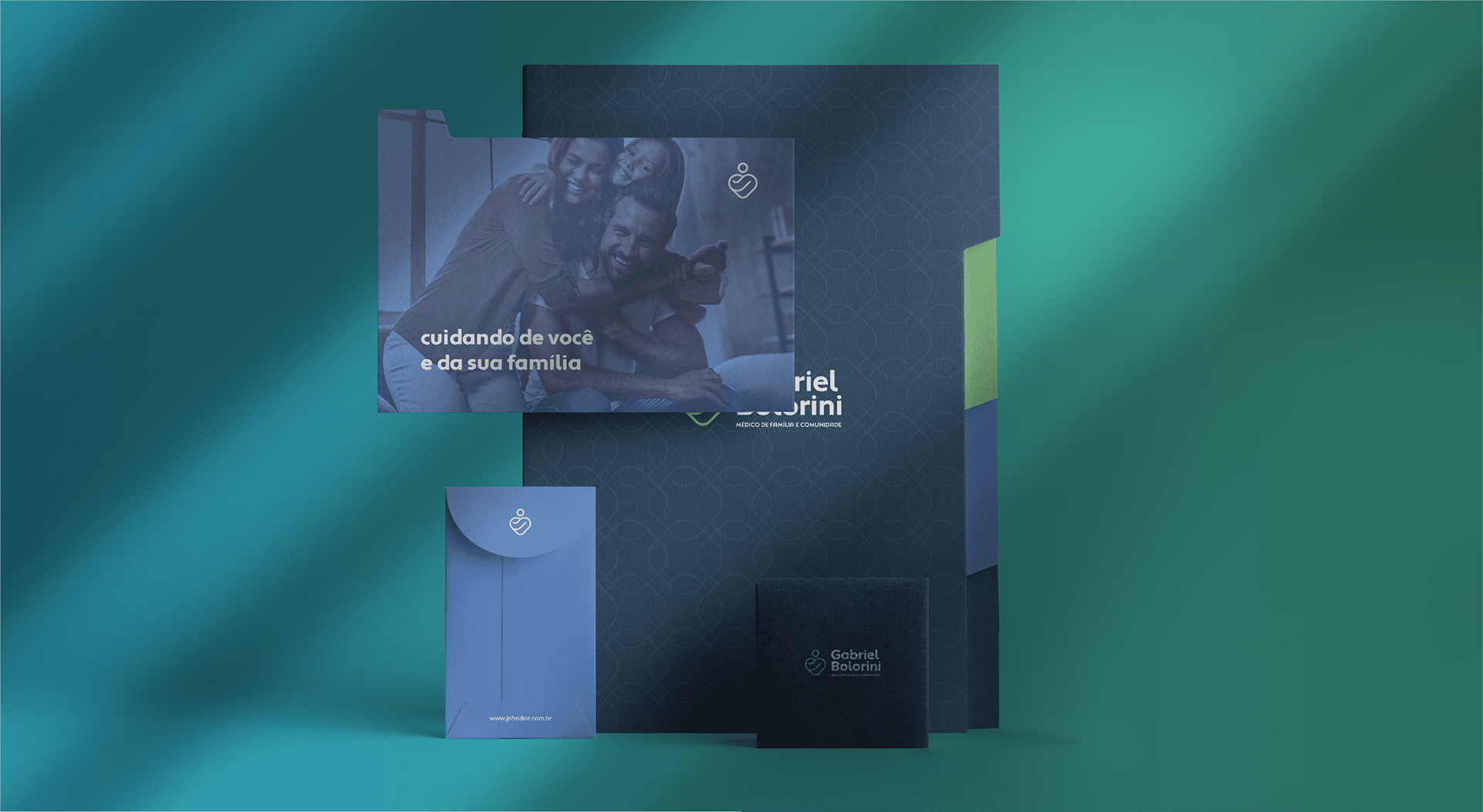
O objetivo principal desse projeto foi trazer equilíbrio entre sentimentos: apresentar sensibilidade e humanização, em uma identidade profissional e que represente bem uma marca pessoal masculina. Todos os elementos escolhidos tem peso nesse equilíbrio, como paleta de cores, símbolo, tipografia, elementos, etc.
The main goal of this project was to bring balance between feelings: to present sensibility and humanization, in a professional identity that represents well a personal masculine brand. All the chosen elements have weight in this balance, such as color palette, symbol, typography, elements, etc.

A tipografia do logotipo é minimalista e moderna, além de ser clara, facilitando a leitura e aplicação. O acabamento mais arredondado torna a marca mais próxima e amigável.
The typography of the logo is minimalist and modern, and clear, making it easy to read and apply. The more rounded finish makes the brand more approachable and friendly.


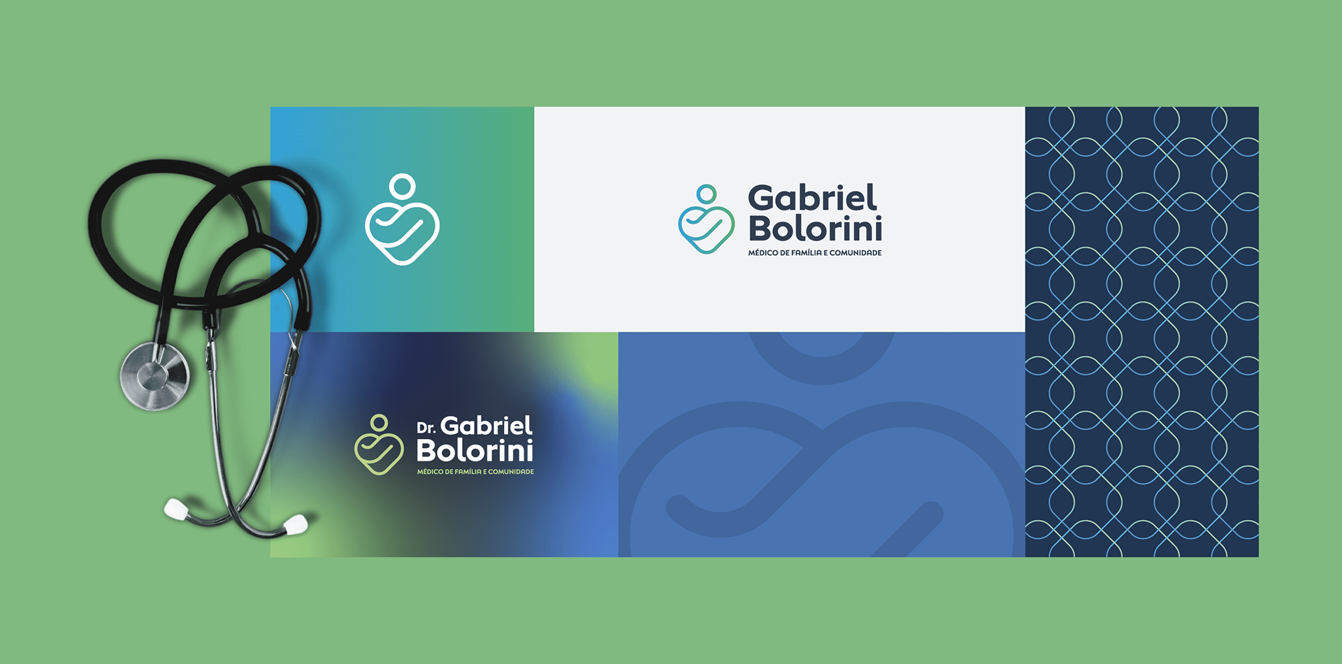
No equilíbrio que buscamos nesse projeto, o símbolo é o que mais deixa a marca humana, empática e próxima. Referenciando o conceito da medicina da família e comunidade, o isotipo retrata cuidado, carinho e empatia com as pessoas no geral, de maneira minimalista e simples, mas marcante e com muito significado.
In the balance we seek in this project, the symbol is the one that leaves the most human, empathetic and close mark. Referencing the concept of family and community medicine, the isotype portrays care, affection and empathy with people in general, in a minimalist and simple way, but striking and with a lot of meaning.