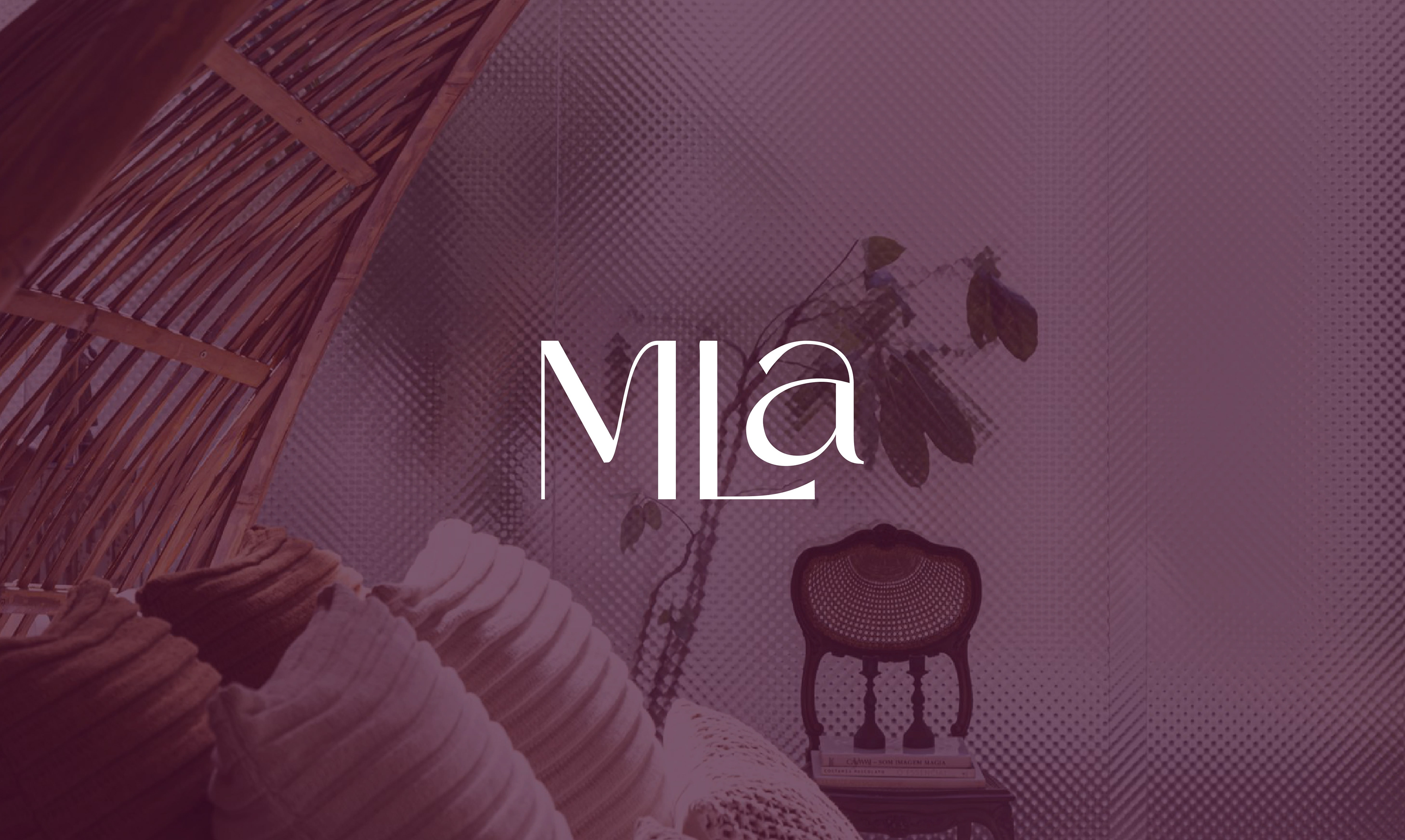
MLA - Arquitetura e Design
Projeto de identidade visual / Visual Identity Projetc
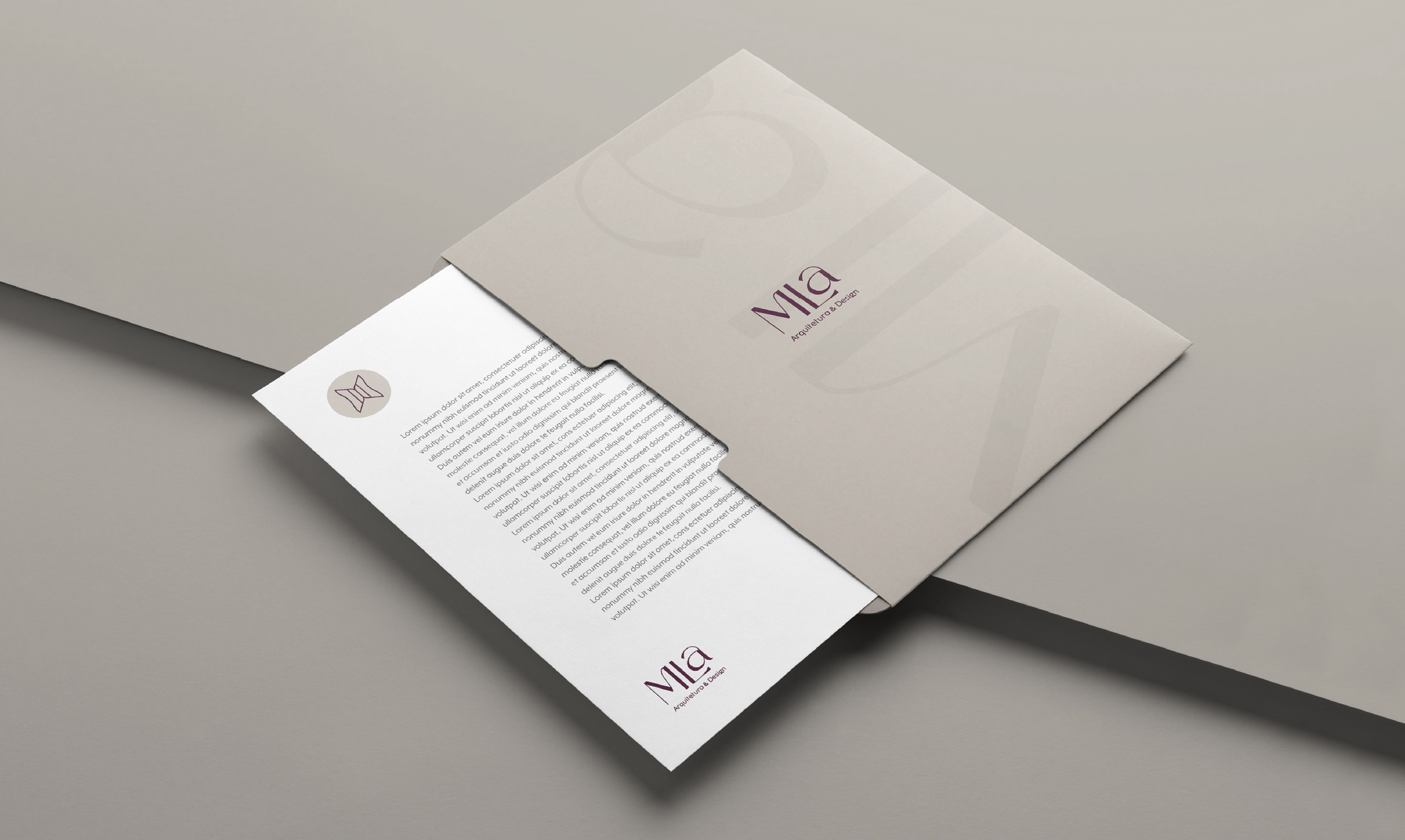
O CLIENTE
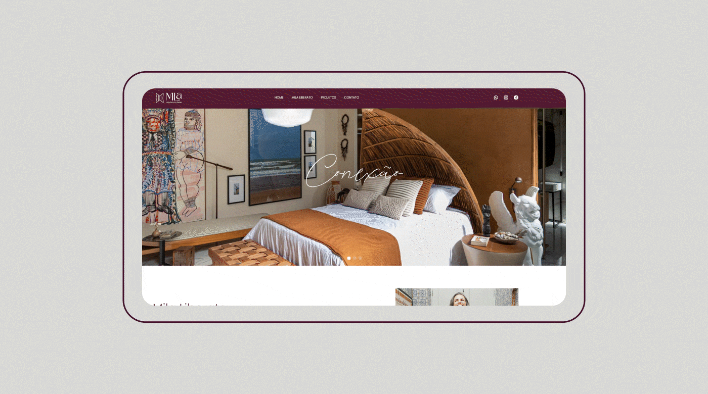
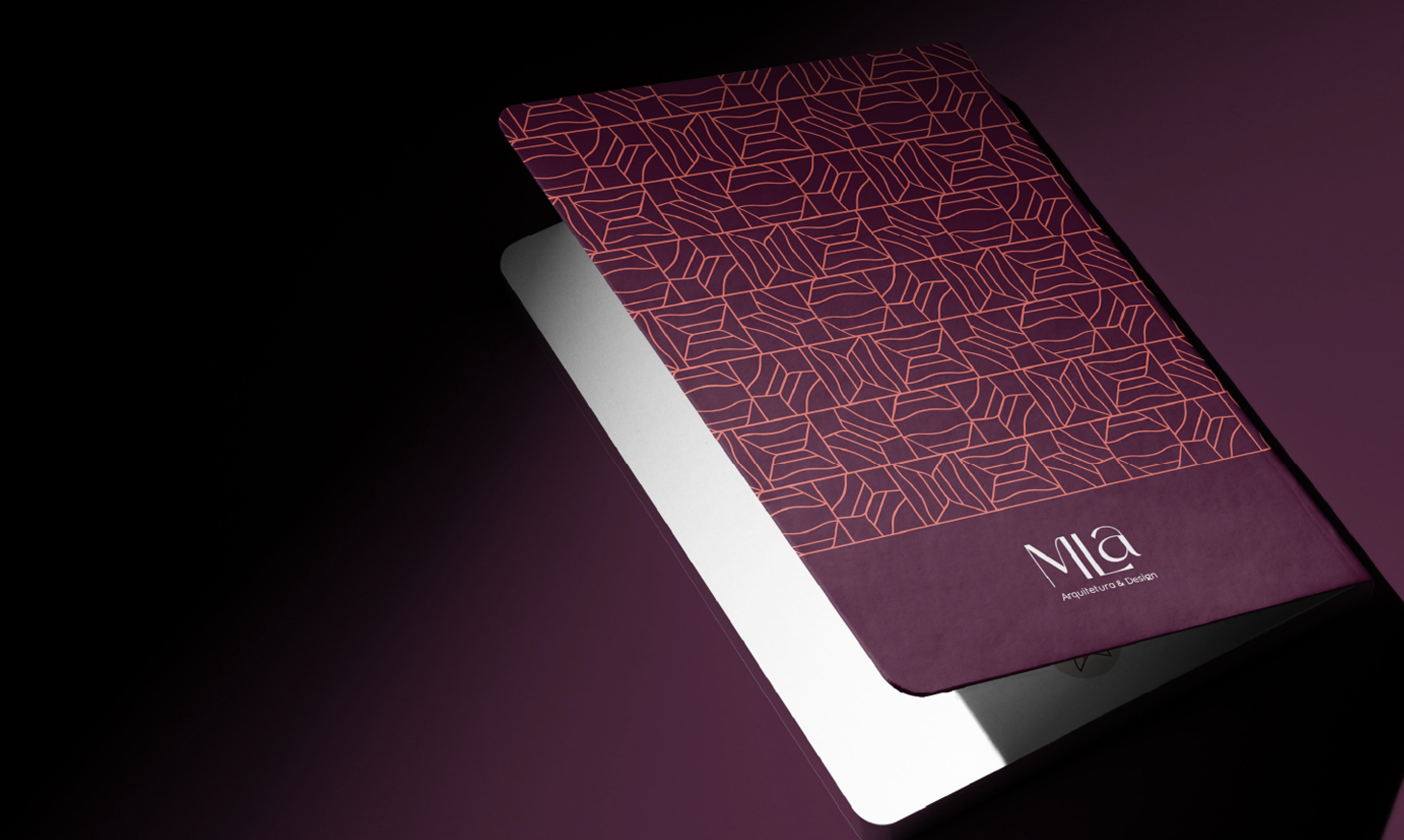
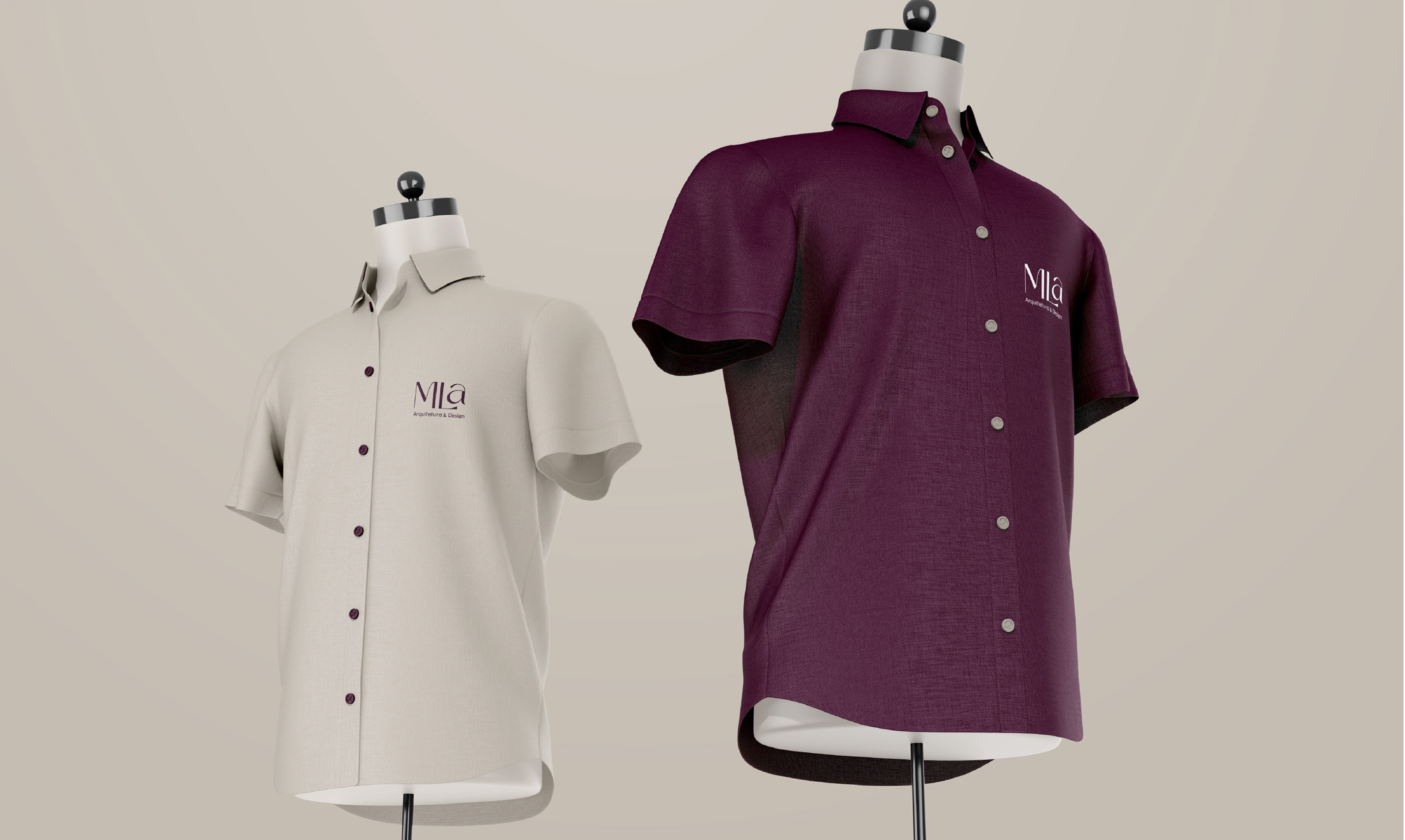
MLA é um escritório de arquitetura de Salvador, Bahia, Brasil. O foco analítico e conceitual sintetiza o resultado a ser alcançado em quatro pilares: conexão, elegância, customização e exclusividade, sempre focando o ser humano como centro dos projetos. Trabalham com projetos comerciais, corporativos e institucionais também. THE CLIENT
MLA is an architecture office in Salvador, Bahia, Brazil. The analytical and conceptual focus synthesizes the result to be achieved in four pillars: connection, elegance, customization and exclusivity, always focusing on the human being as the center of the projects. They work with commercial, corporate, and institutional projects as well.
-
DESAFIO
Nesse projeto fizemos um redesign da marca pessoal da proprietária, adaptando-a para o conceito empresarial. Como a marca antiga já era conhecida pelo público-alvo e a proprietária já tem seu trabalho consolidado no mercado, um dos desafios foi fazer essa atualização sem desprender-se completamente dela, mas trazendo novos atributos que eram necessários.
THE CHALLENGE
In this project we redesigned the owner's personal brand, adapting it to the business concept. As the old brand was already known by the target audience and the owner already has her work consolidated in the market, one of the challenges was to make this update without completely detaching from it, but bringing new attributes that were necessary.

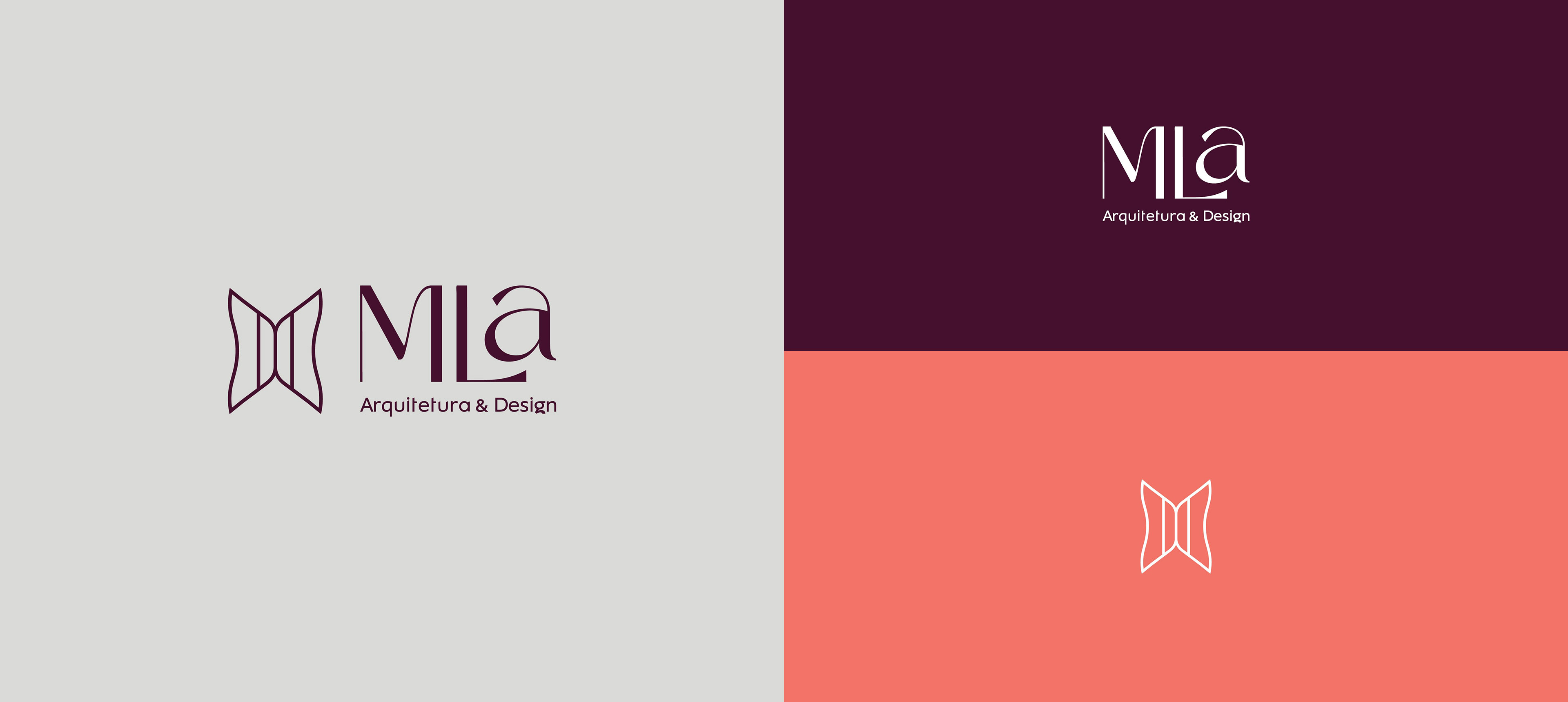


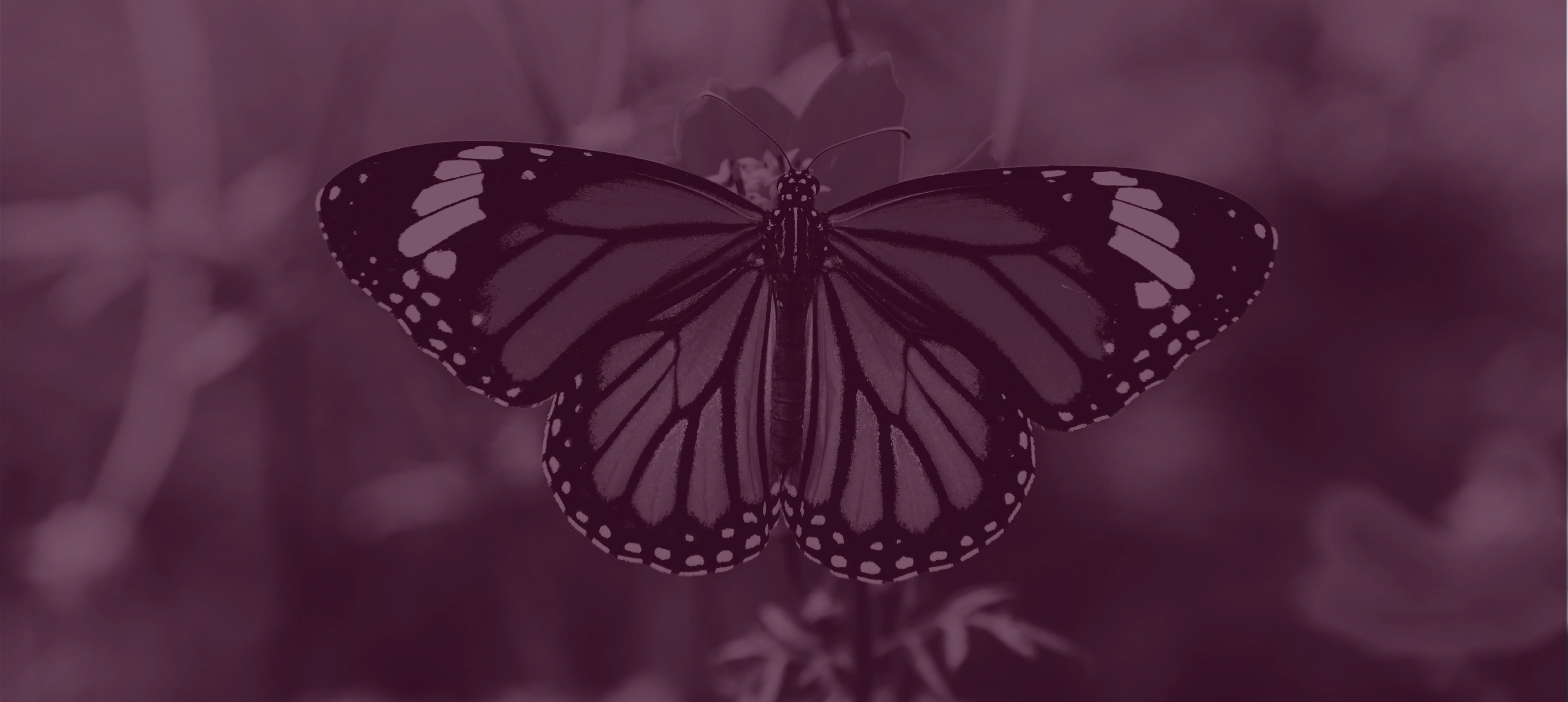
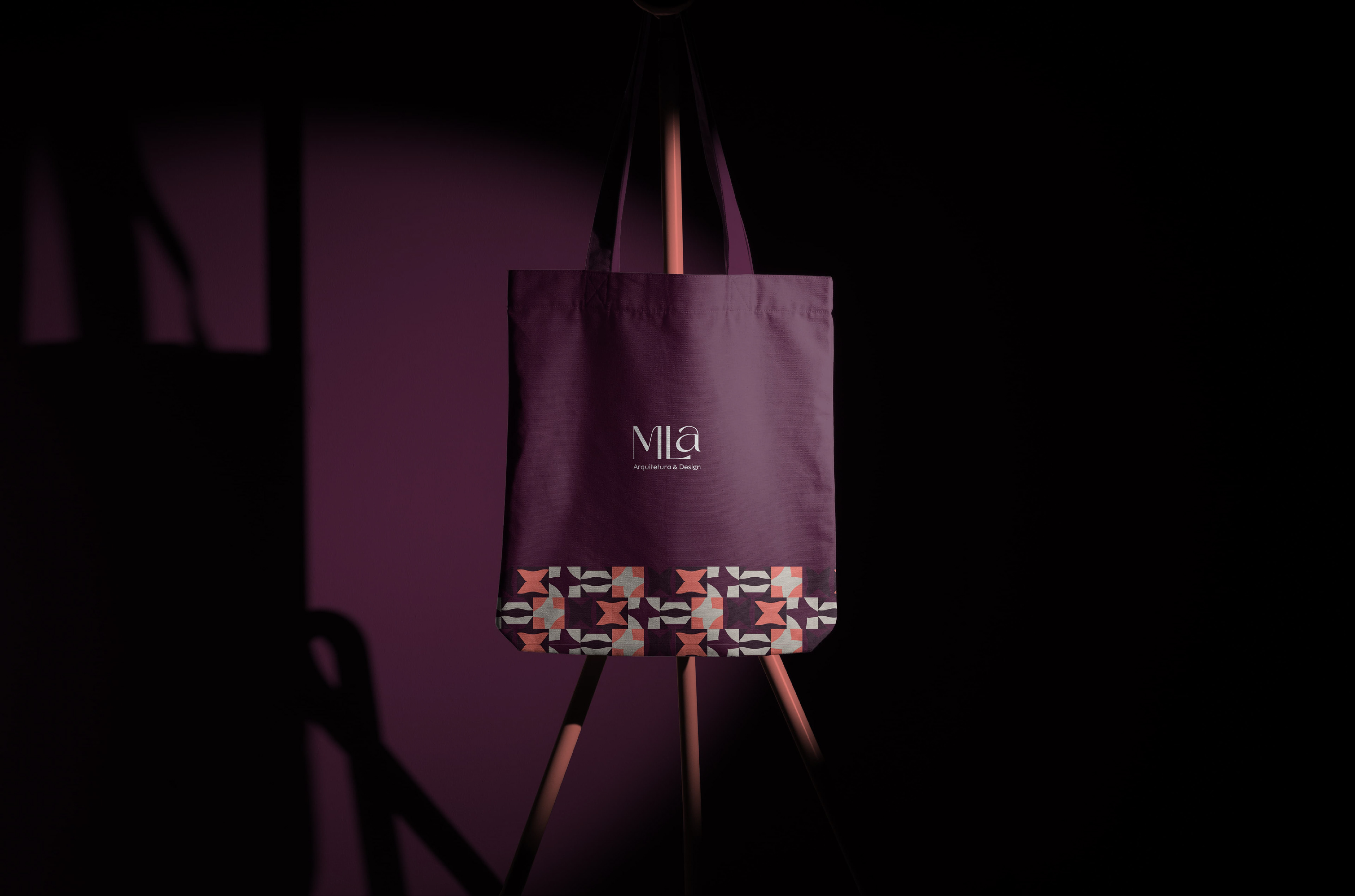
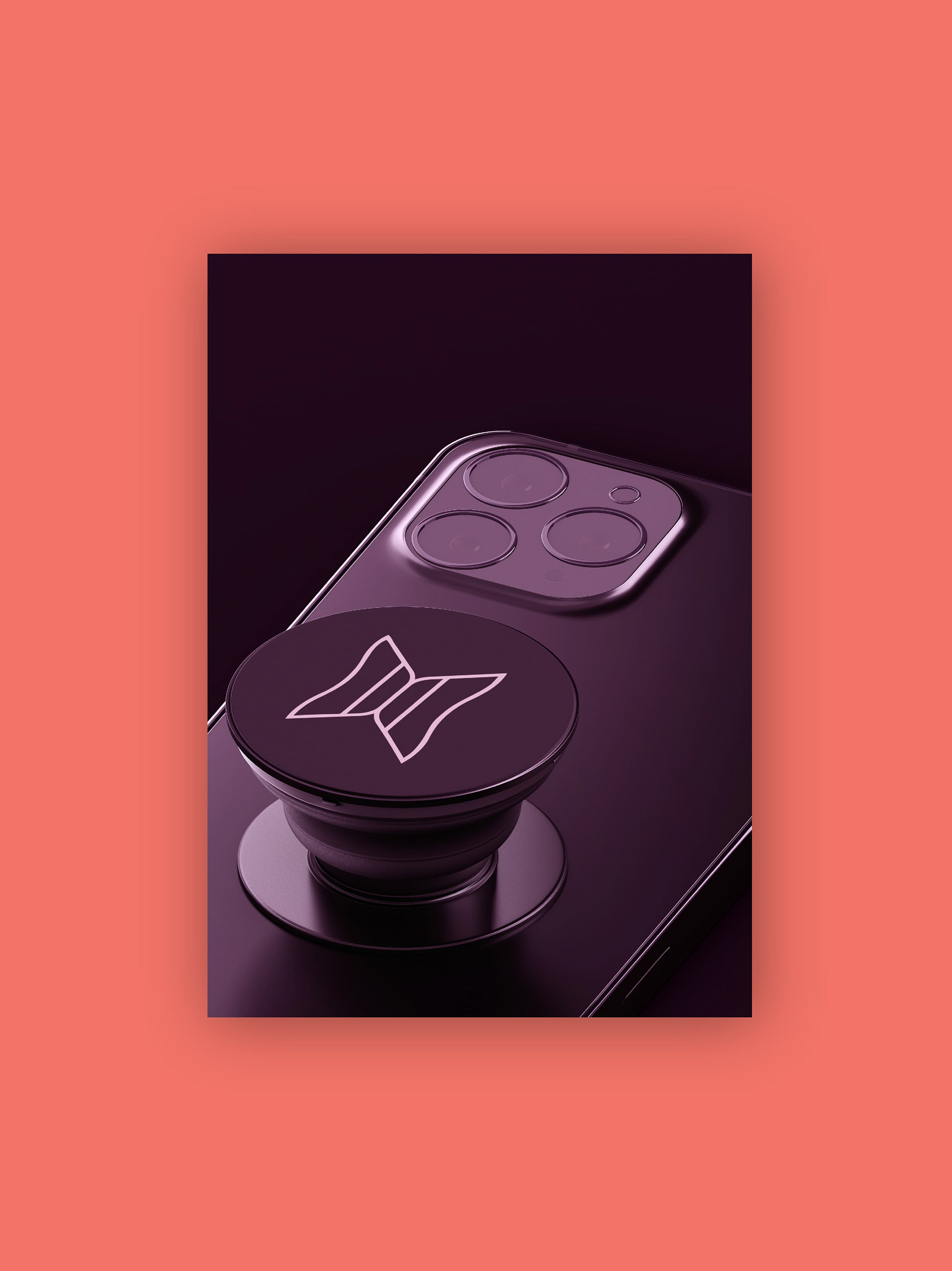
Conceito do símbolo
Todo projeto foi embasado em ser fora da caixa. A cliente sempre apontou não gostar de nada convencional da área, portanto, todas decisões seguiram esse norte.
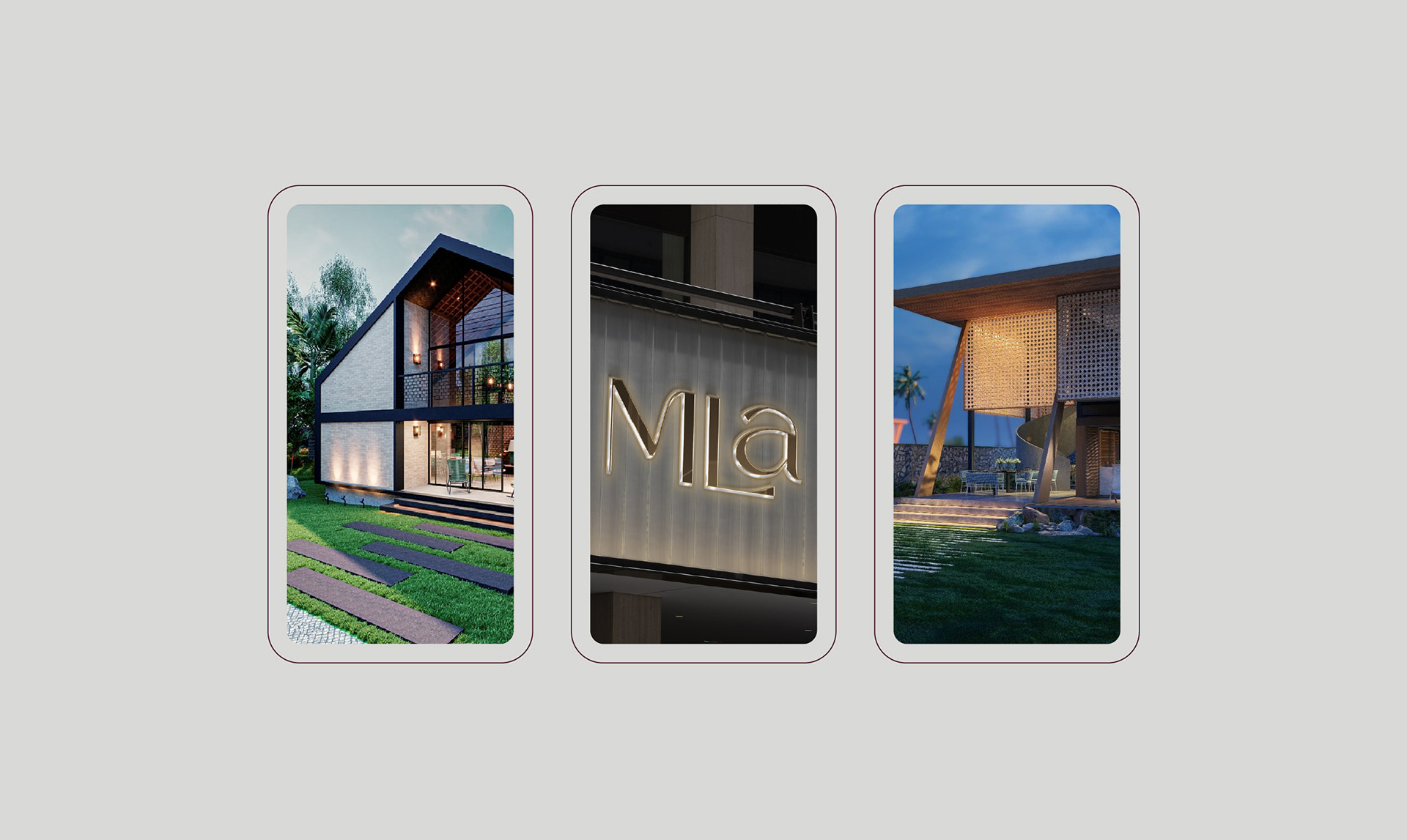
O trabalho do arquiteto está presente em momentos muito importantes na vida das pessoas. A construção de um lar, a idealização do negócio próprio, alguma TRANSFORMAÇÃO na vida que precisa refletir naquele ambiente/espaço. Enfim, são eventos que geralmente carregam uma carga emocional muito grande.
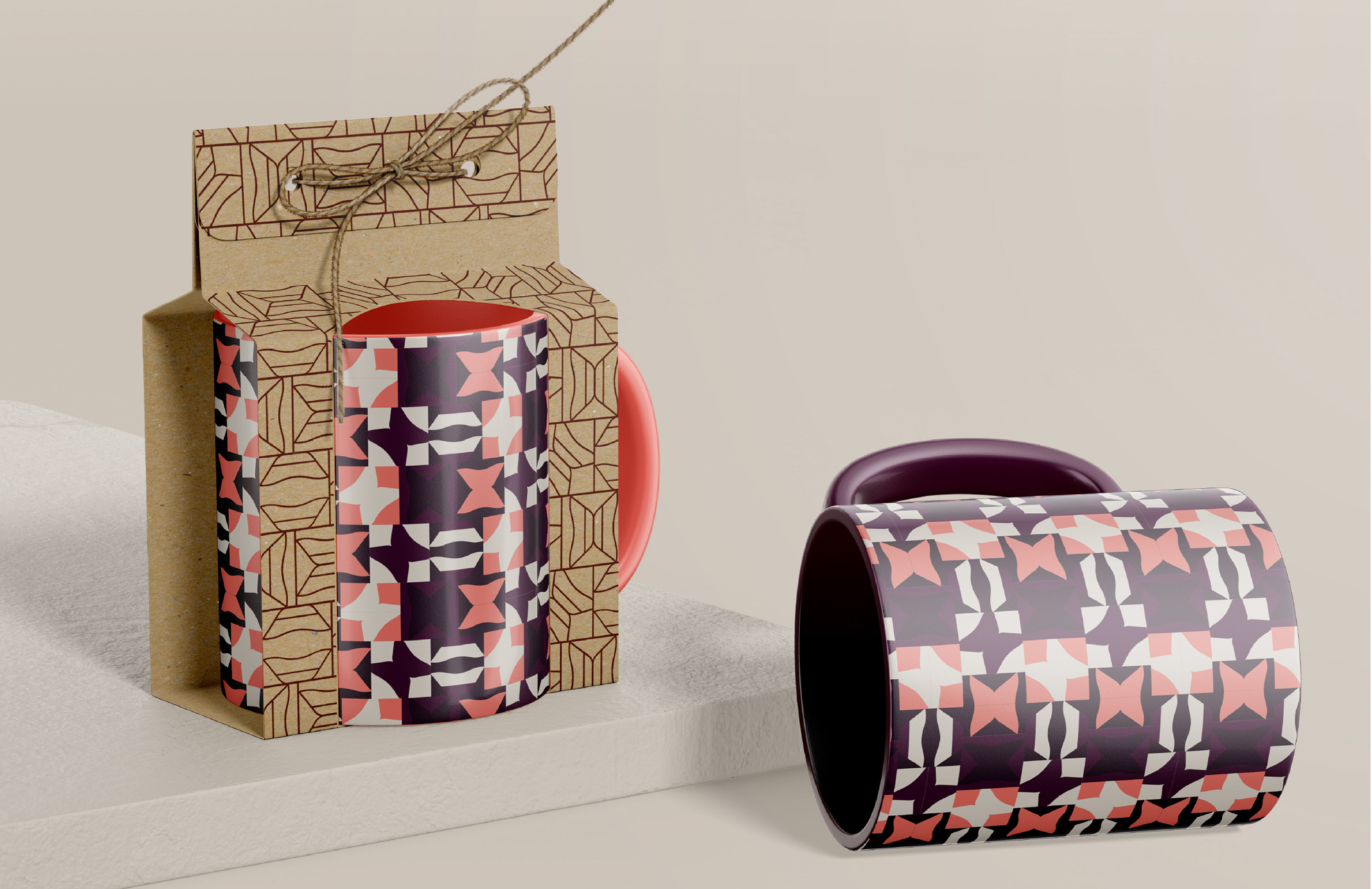
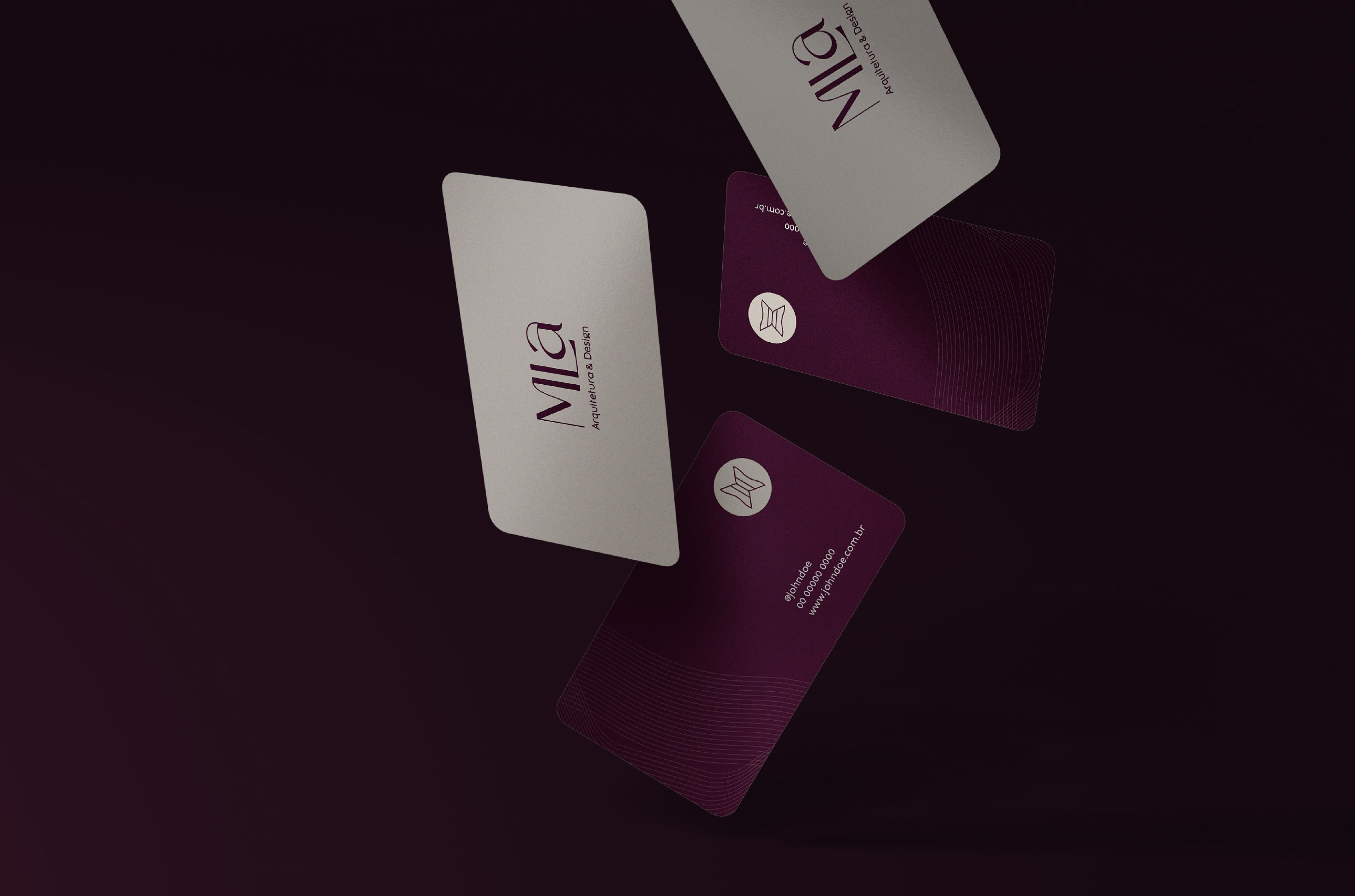
A simbologia da borboleta está totalmente alinhada a proposta: ela simboliza a transformação, felicidade, beleza e renovação.
O acabamento minimalista e geométrico comunica-se com o DNA da marca: moderna, sofisticada e simples.
Concept of the symbol
The whole project was based on being outside the box. The client always pointed out that she didn't like anything conventional in the area, therefore, all decisions followed this north.
The architect's work is present in very important moments in people's lives. The construction of a home, the idealization of one's own business, some TRANSFORMATION in life that needs to reflect in that environment/space. In short, these are events that usually carry a great emotional charge.
The symbolism of the butterfly is totally aligned with the proposal: it symbolizes transformation, happiness, beauty, and renewal.
The minimalist and geometric finish communicates with the brand's DNA: modern, sophisticated, and simple.