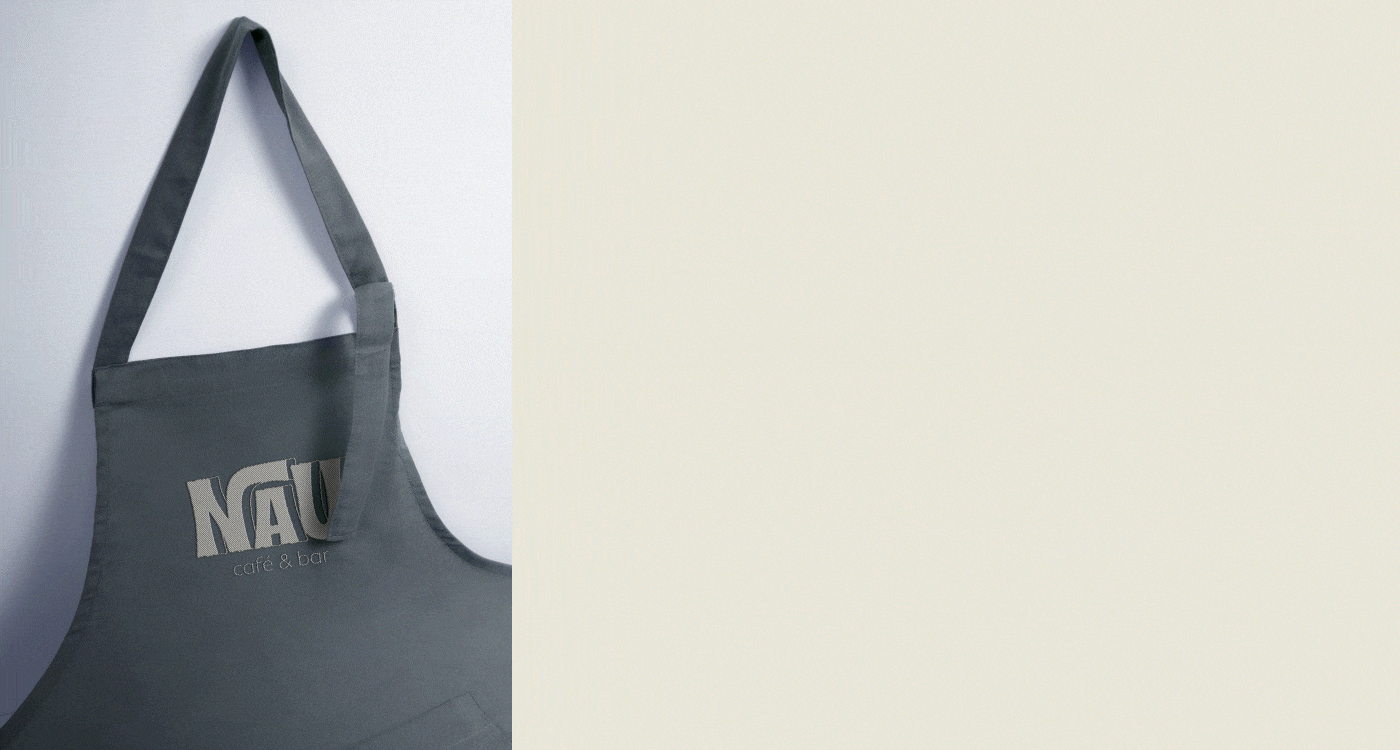
NAU - Café&Bar / NAU - Coffee&Bar
Projeto de identidade visual / Visual Identity Projetc
O CLIENTE
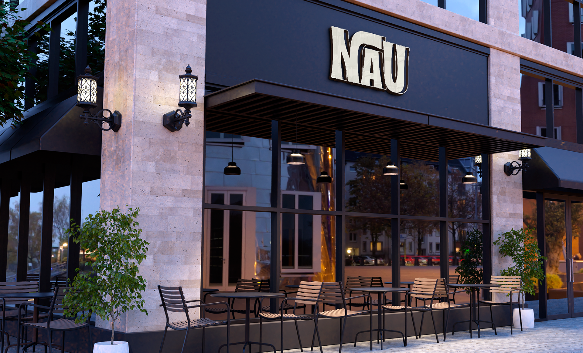
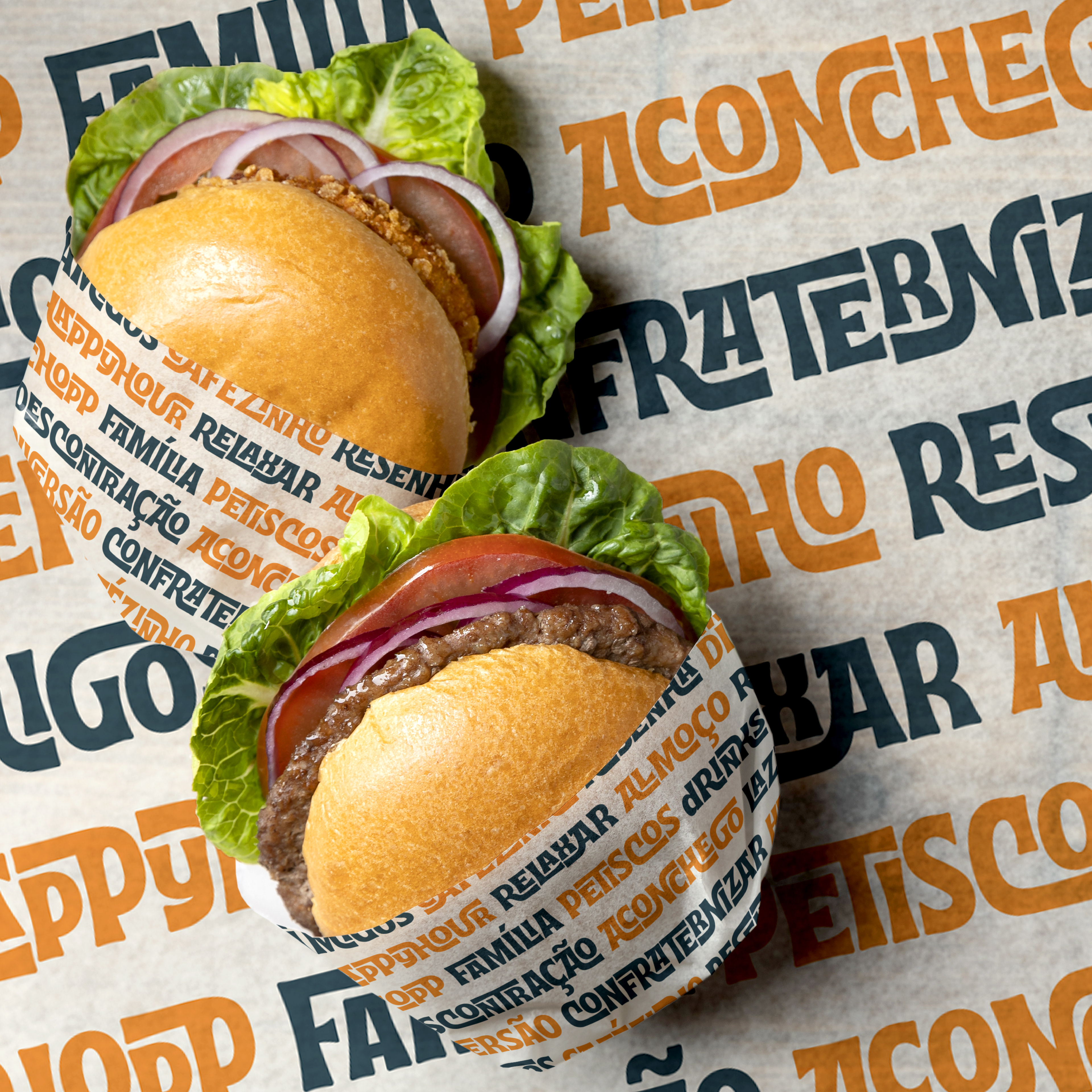
Nau é um Café Bar de São Sebastião do Paraíso - MG - Brasil. Alocado dentro de uma galeria e com amplo horário de funcionamento, o estabelecimento fornece café da manhã, almoço, café da tarde e happy hour.
O objetivo do negócio é ser a opção perfeita para clientes que querem produtos de qualidade e um ambiente agradável e diferente na cidade, podendo ser frequentado a qualquer horário do dia, com família, amigos, ou até mesmo sozinho.
THE CLIENT
Nau is a Coffee Bar in São Sebastião do Paraíso - MG - Brazil. Located inside a gallery and with wide opening hours, the establishment provides breakfast, lunch, afternoon coffee and happy hour.
The goal of the business is to be the perfect option for customers who want quality products and a pleasant and different environment in the city, which can be frequented at any time of the day, with family, friends, or even alone.
-
DESAFIO
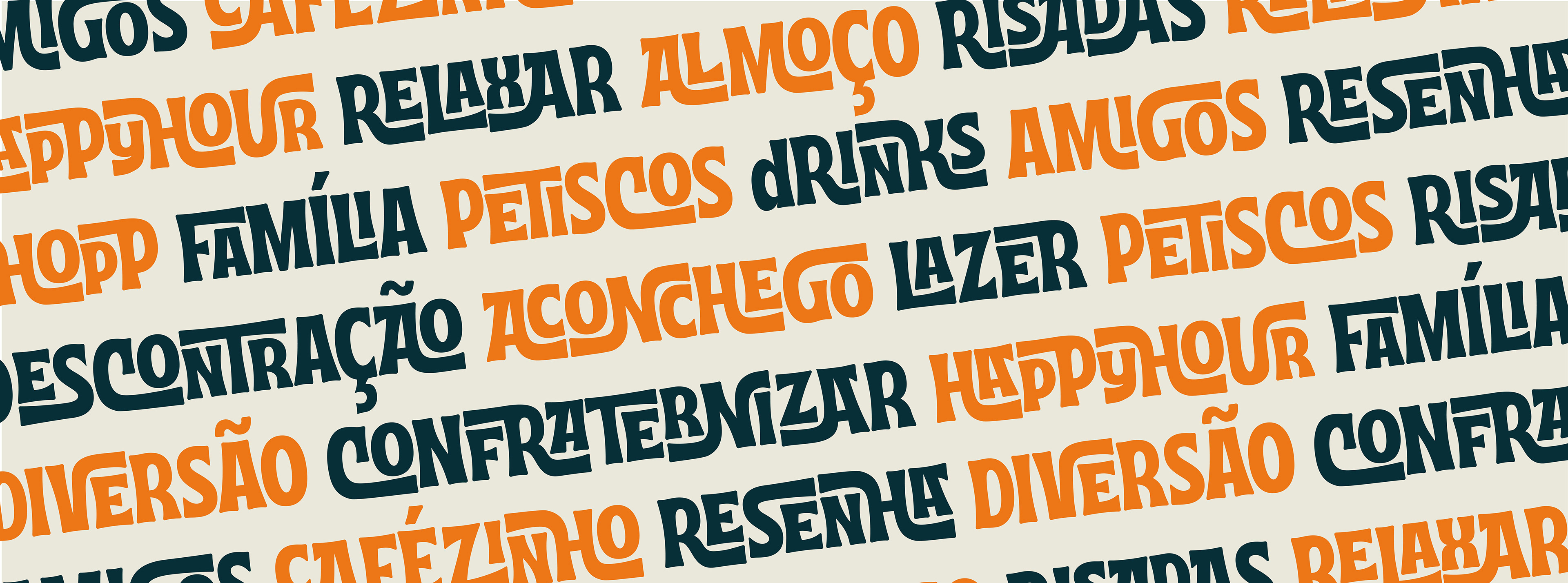
Algumas características da personalidade da marca são: extrovertida, alegre, criativa, moderna e aventureira. O desafio do projeto foi aliar essa personalidade ao desejo de trazer a imagem de novidade para a cidade - retratando algo descontraído, versátil, elegante, mas aconchegante.
THE CHALLENGE
Some characteristics of the brand personality are: extroverted, cheerful, creative, modern and adventurous. The challenge of the project was to combine this personality with the desire to bring the image of novelty to the city - portraying something relaxed, versatile, elegant, but cozy.


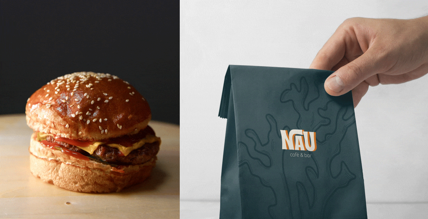


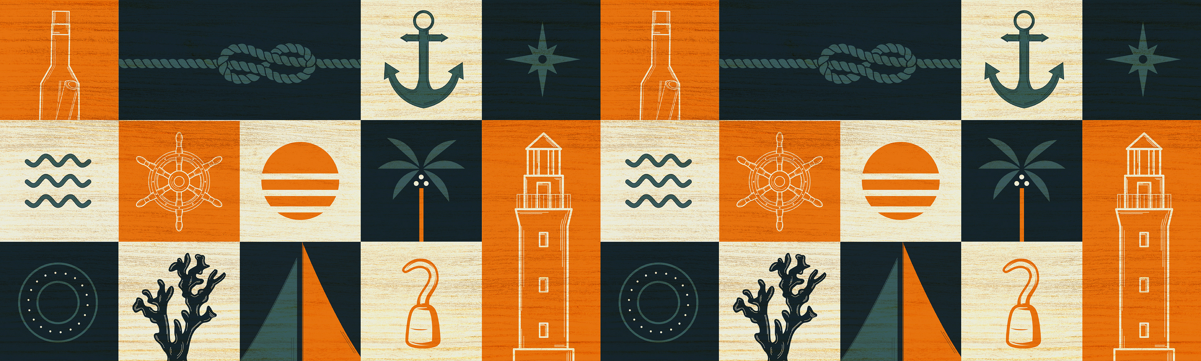
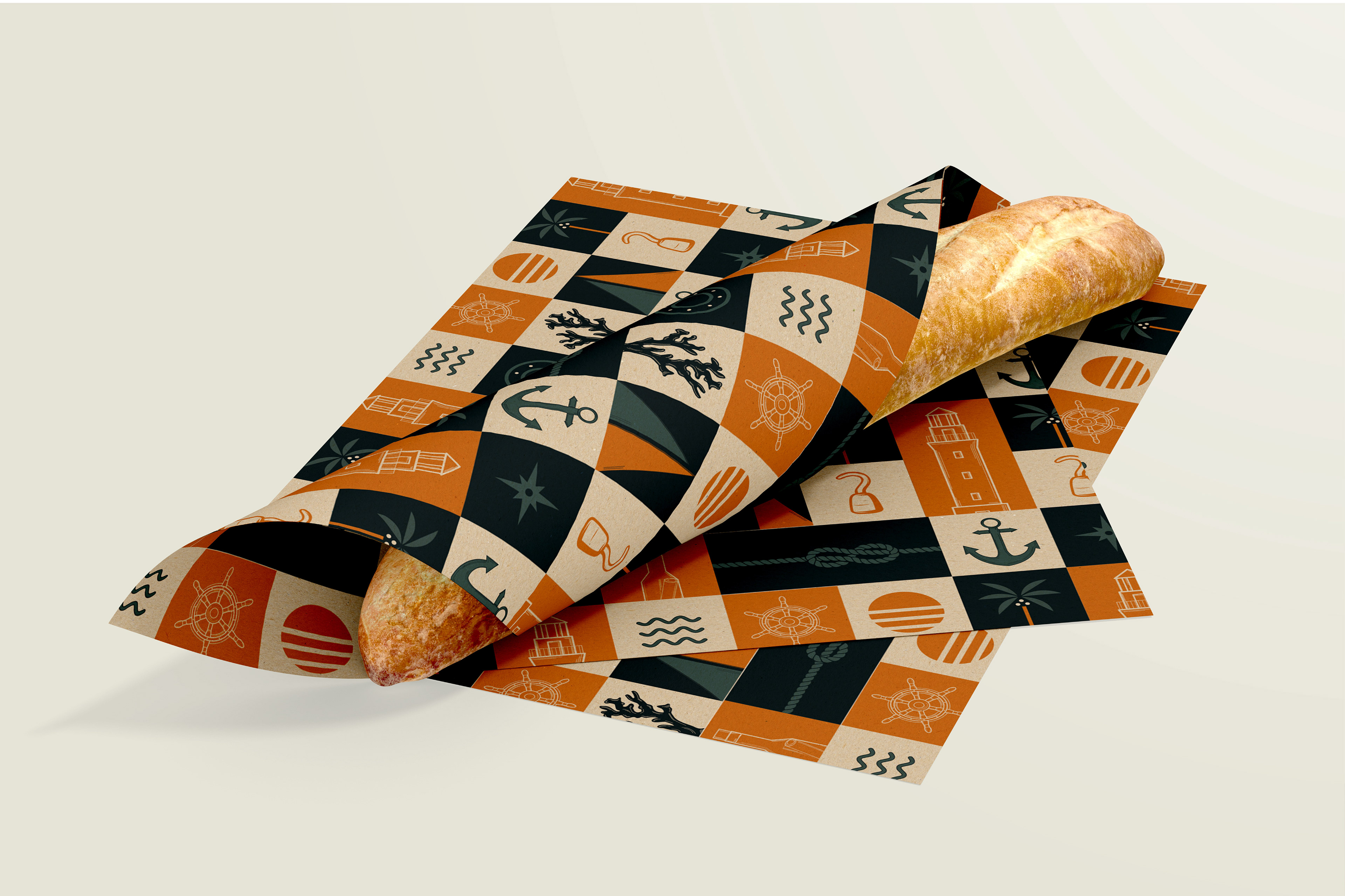
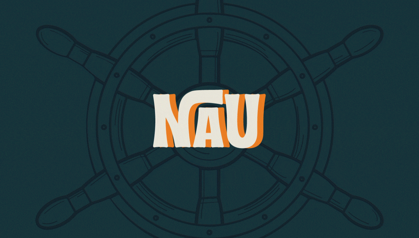
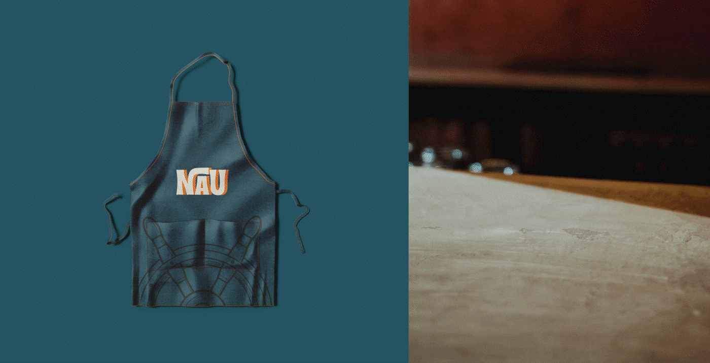
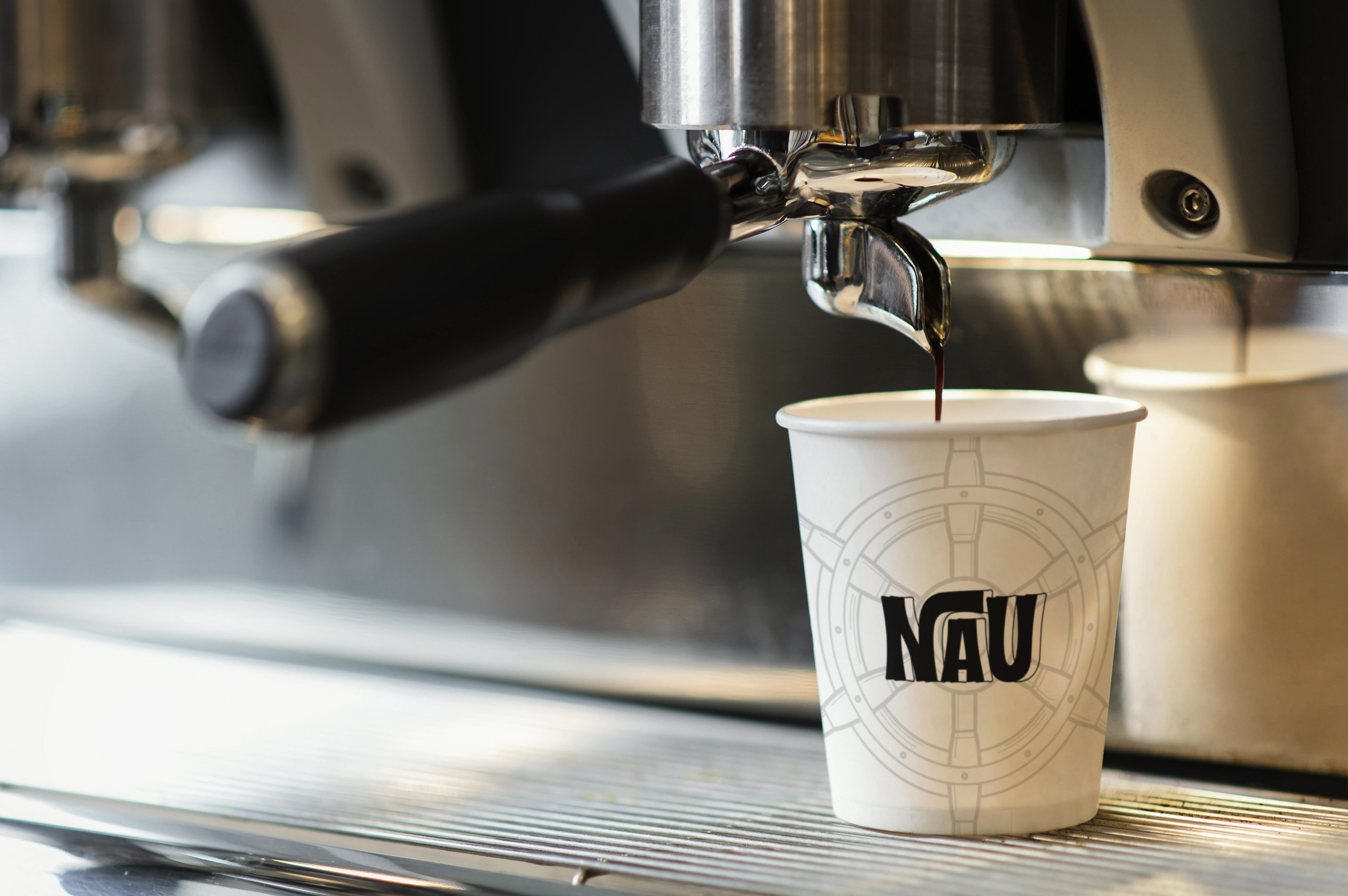
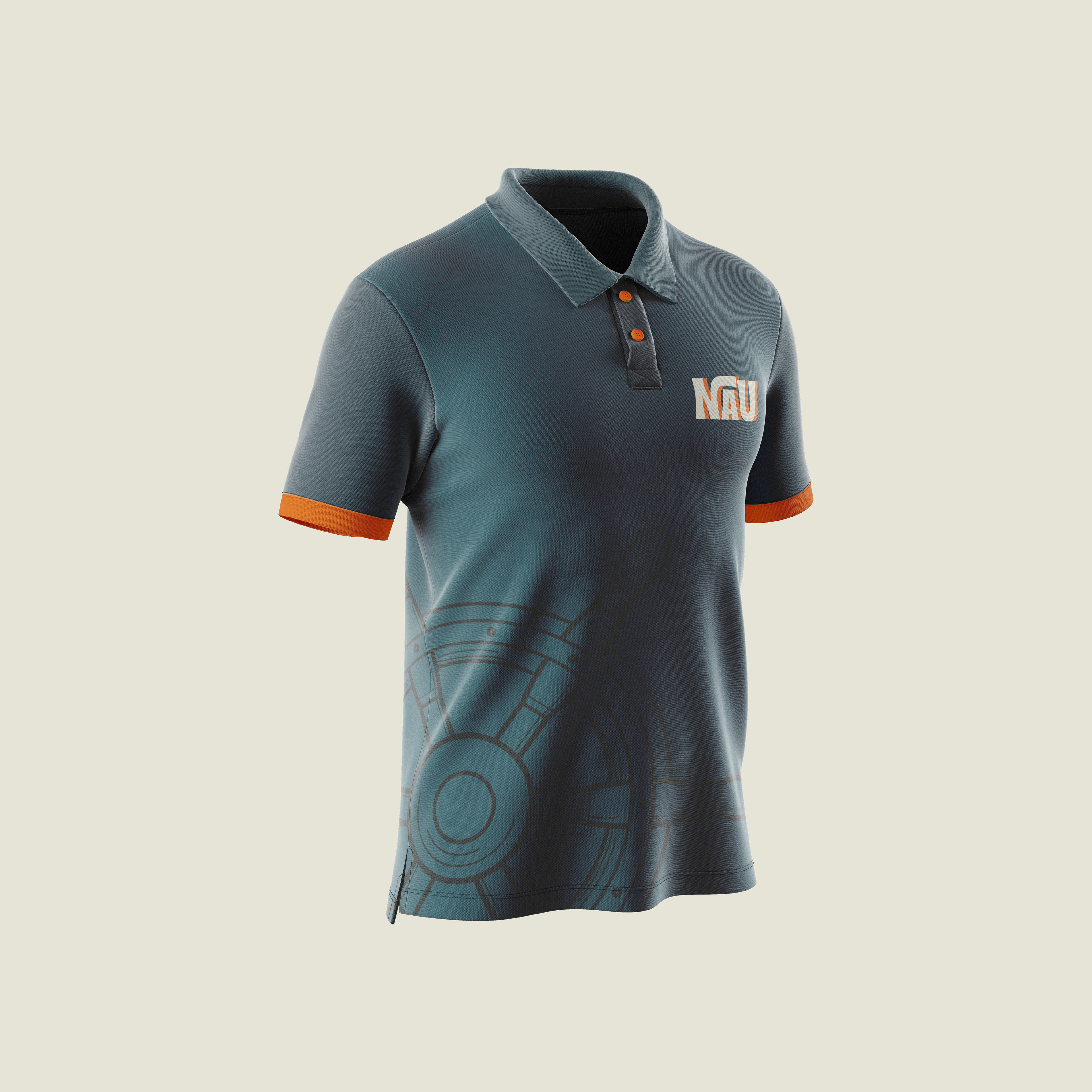
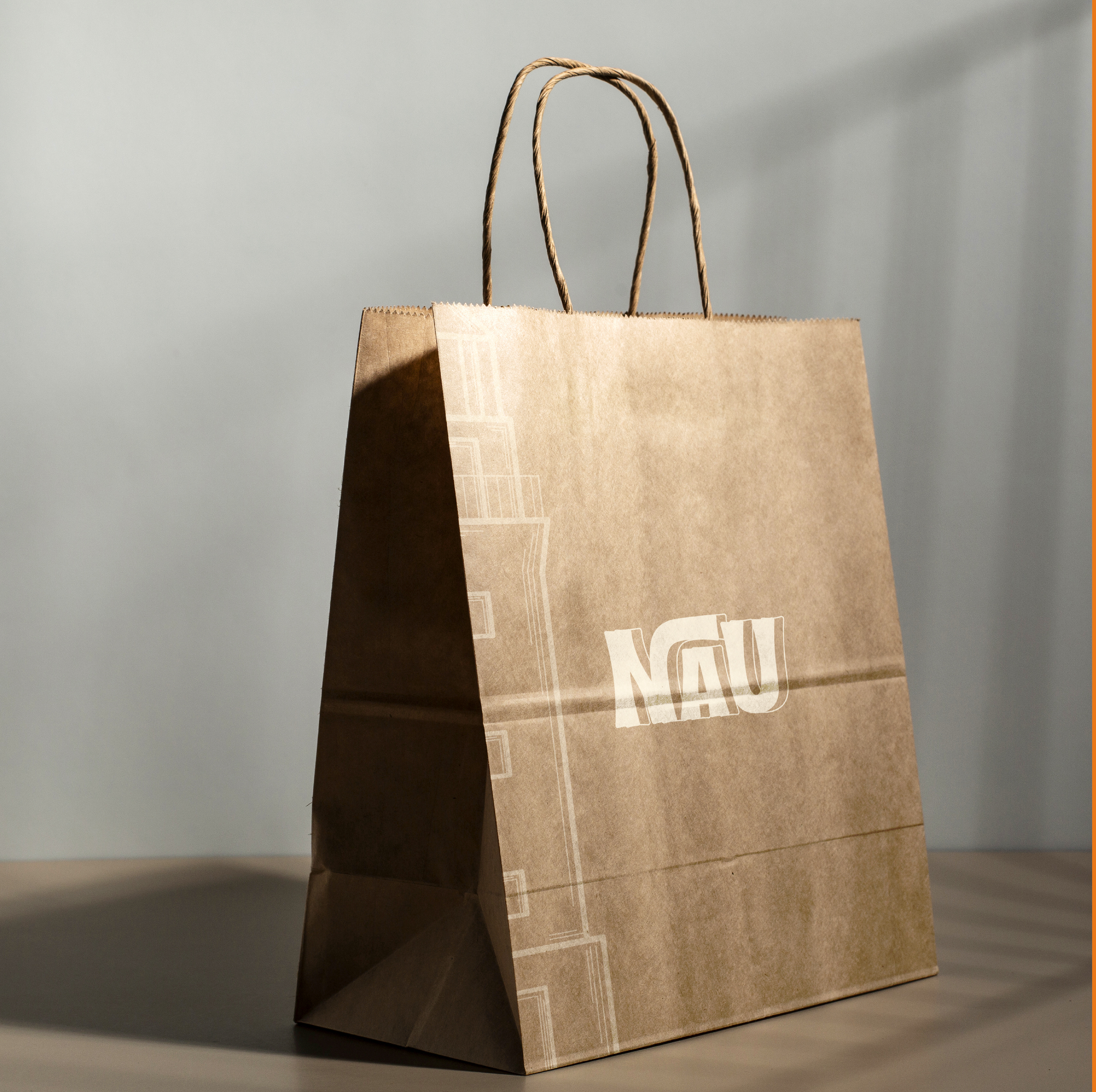
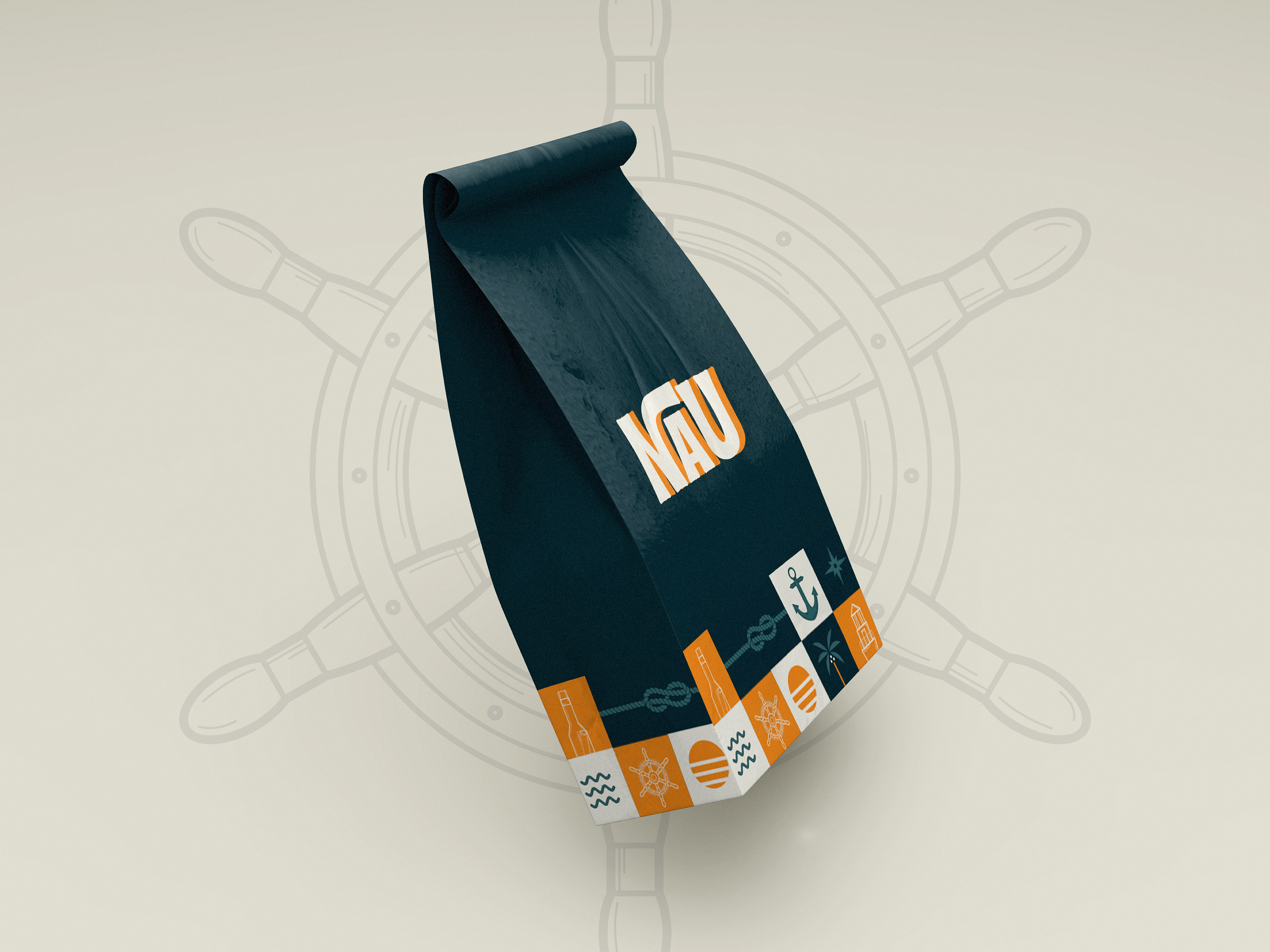
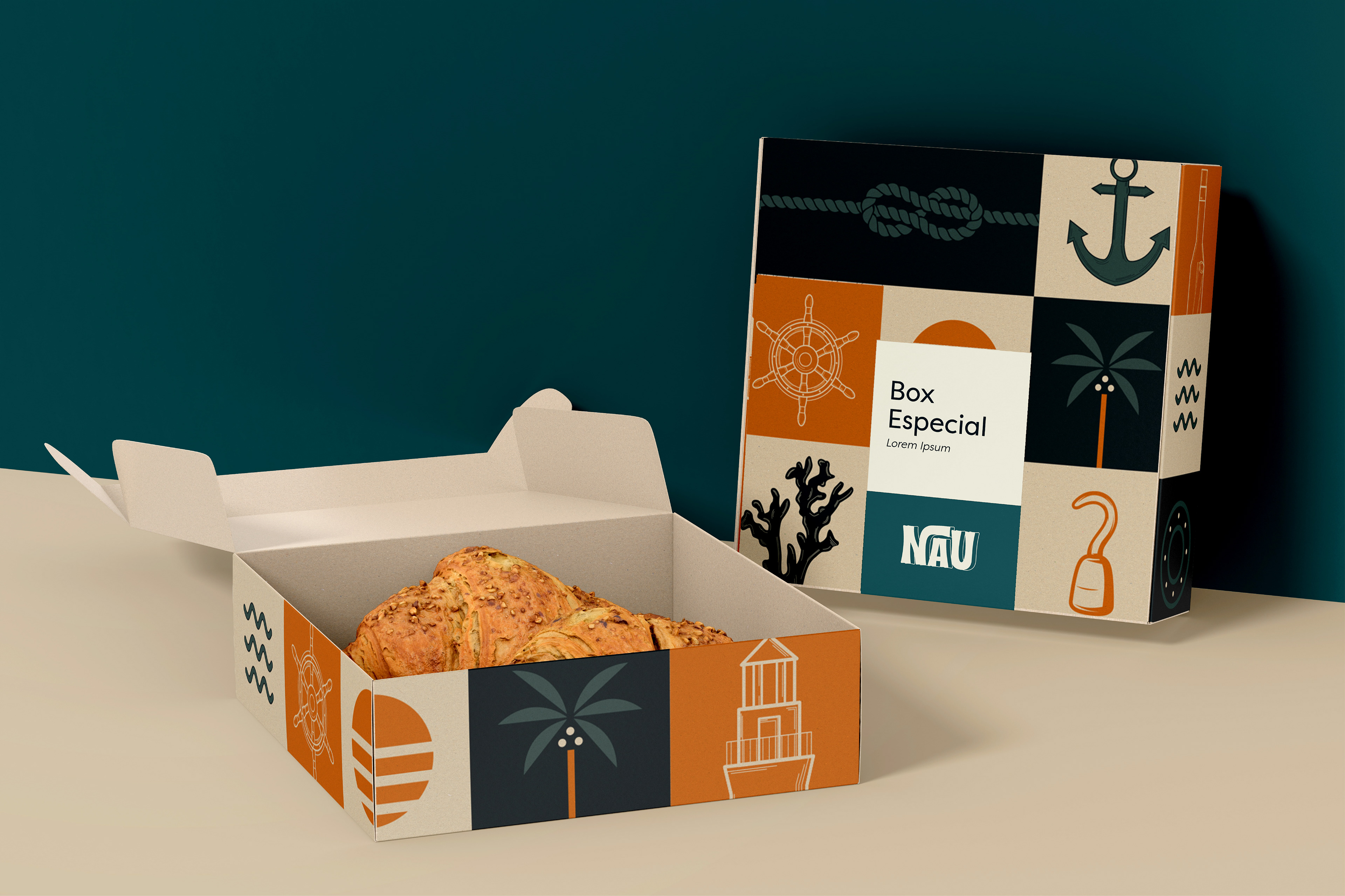
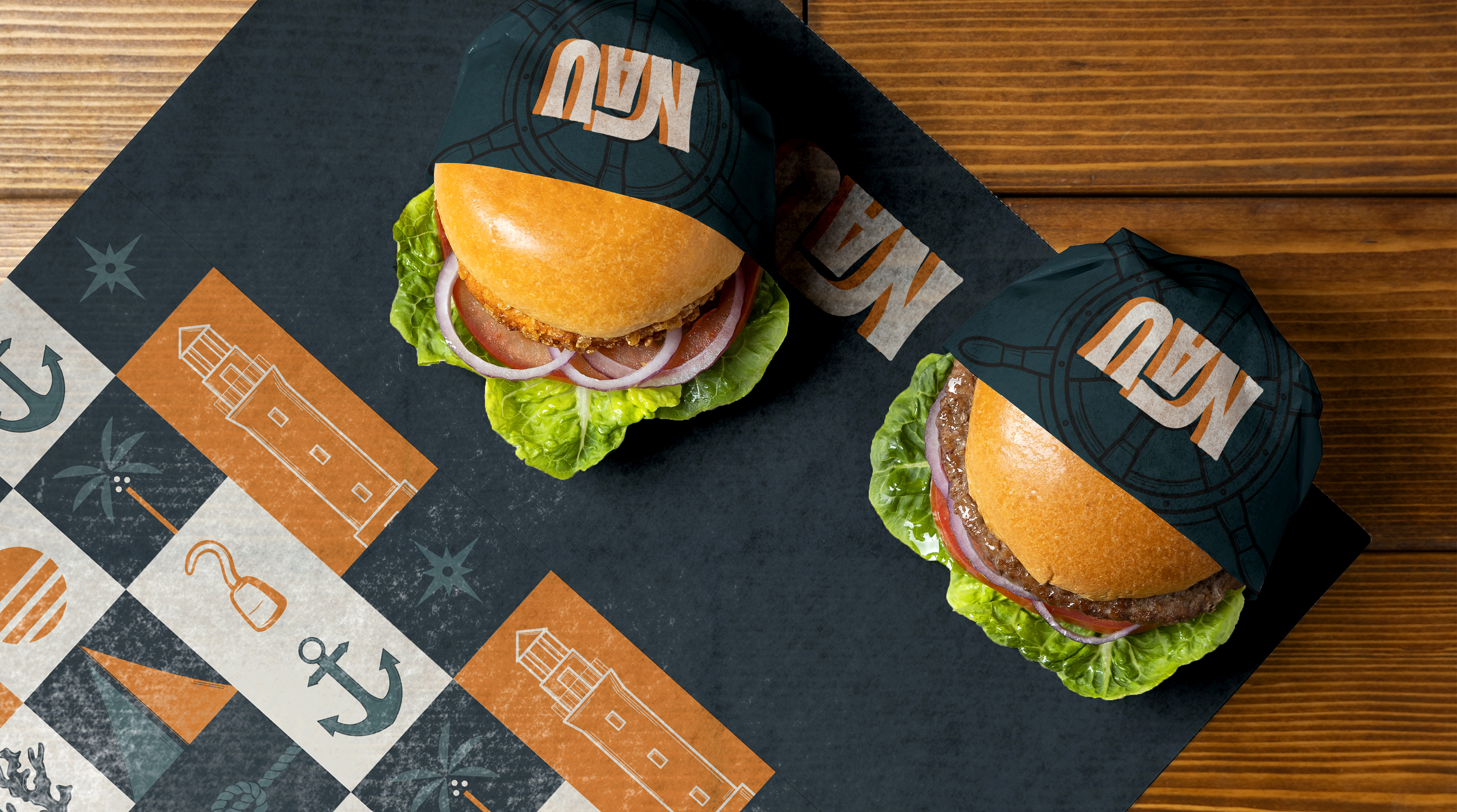
Como solução, desenvolvemos toda temática da identidade visual permeando o nome, NAU, que é um tipo de embarcação. Tipografia, paleta de cores, ilustrações, elementos, foram desenvolvidos com a premissa náutica, conectando o nome ao visual da marca. Tomamos bastante cuidado para não trazer elementos que pudessem dar a impressão do restaurante ser voltado a frutos do mar.
As a solution, we developed the entire theme of the visual identity permeating the name, NAU, which is a type of boat. Typography, color palette, illustrations, elements, were developed with the nautical premise, connecting the name to the brand's visual. We were very careful not to bring elements that could give the impression of the restaurant being focused on seafood.
-
Para as cores, diferente do usual navy (vermelho, branco e azul marinho) optamos por trazer nuances de verde e o laranja em contraste. Os tons de verde comunicam o nicho, já o laranja traz energia e vivacidade.
For the colors, different from the usual navy (red, white and navy blue) we chose to bring shades of green and orange in contrast. The shades of green communicate the niche, while the orange brings energy and vivacity.